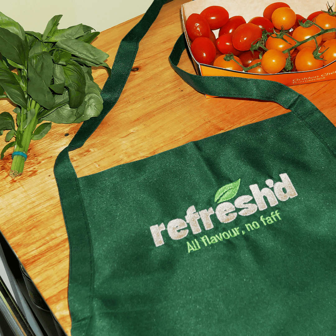
Refresh’d
A rebrand with main character energy
Services: Branding, Art Direction and Graphic Design.
Deliverables: Brand Identity, Logo and Assets Design, Conceptual Work
When the owner of Refresh’d approached me for branding expertise, seeking a creative thinker to conceptualise a fresh visual identity for her small business, I instantly knew we were about to cook up a storm. The brand had already been established for several years, but she was ready to turn up the heat with a rebrand.
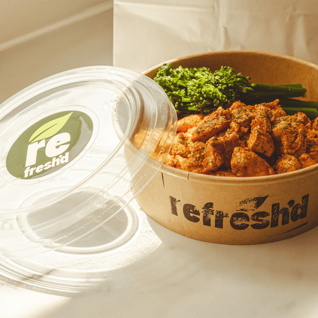
The logo needed to be bold and confident, while still portraying the business as approachable. To strike this balance, I used lowercase typography and softened the edges for a friendlier feel. For added flexibility, I designed a stacked version for use in tighter spaces, and further refined it into a simple, versatile monogram.
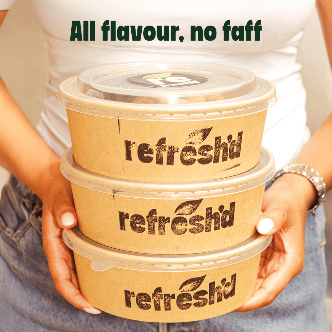

I developed a clear and descriptive strapline that stayed true to the owner's genuine, unfiltered voice.
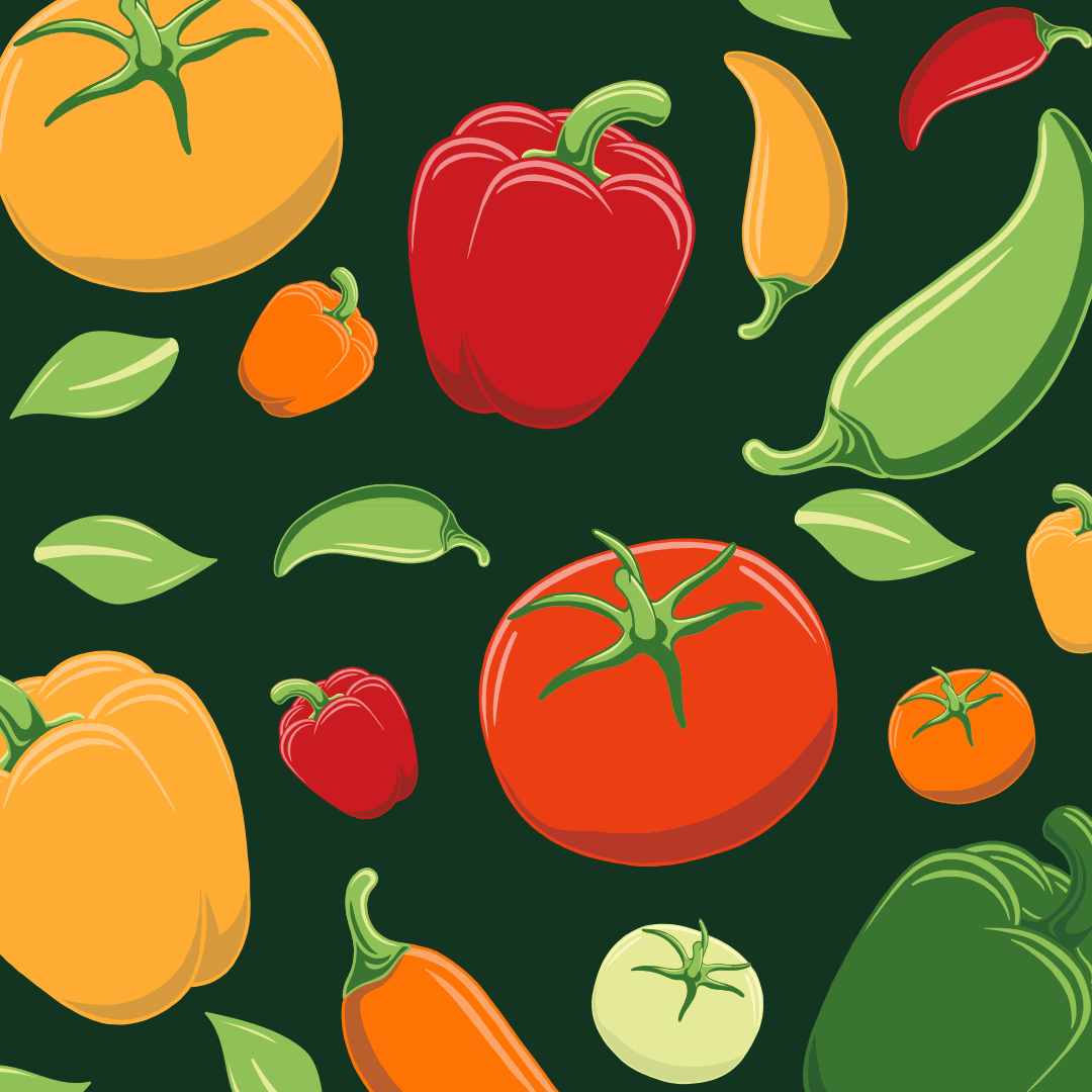
Choosing natural colours, inspired by cooking ingredients, meant that design touchpoints can communicate the freshness of ingredients.


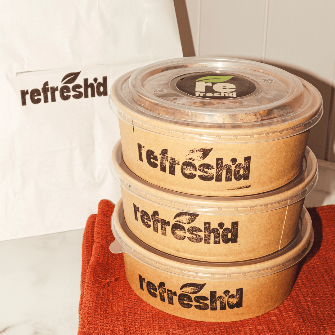
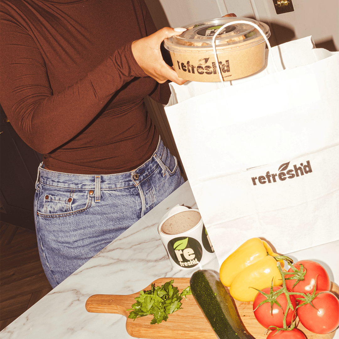
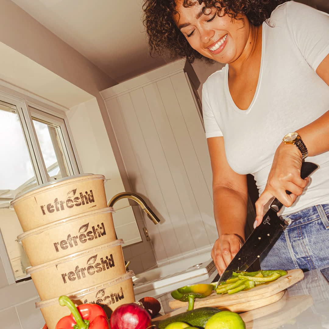
When it came to photography direction, I knew the imagery had to serve Y2K digital camera energy. Because soft lighting is for cookbooks, and this brand needed to dish out big energy and bold flavours.
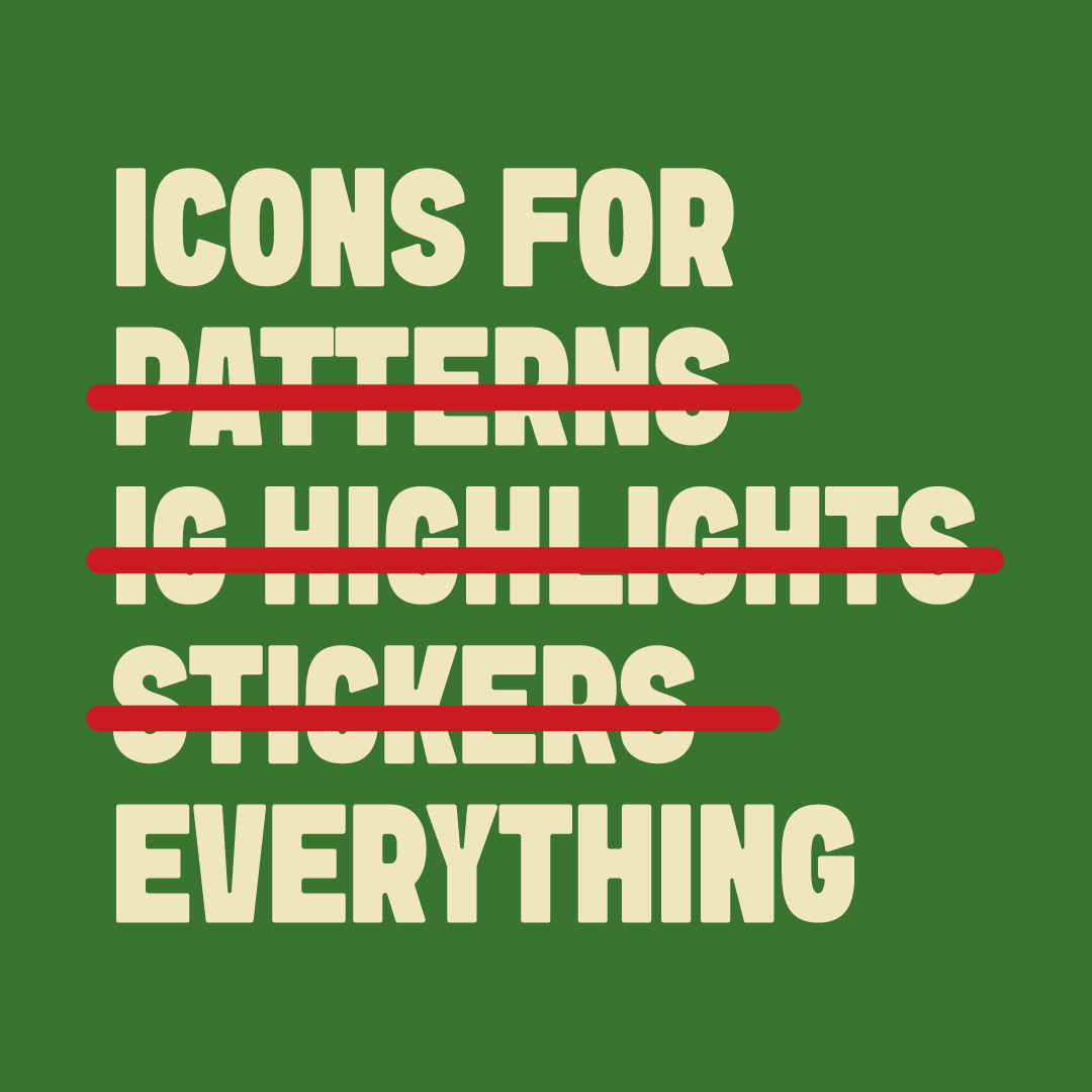
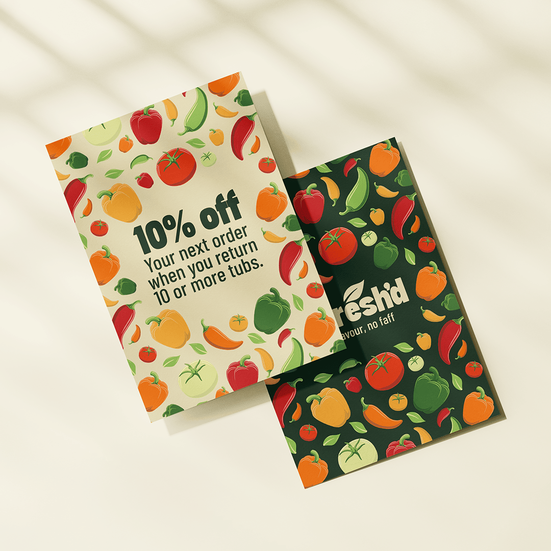
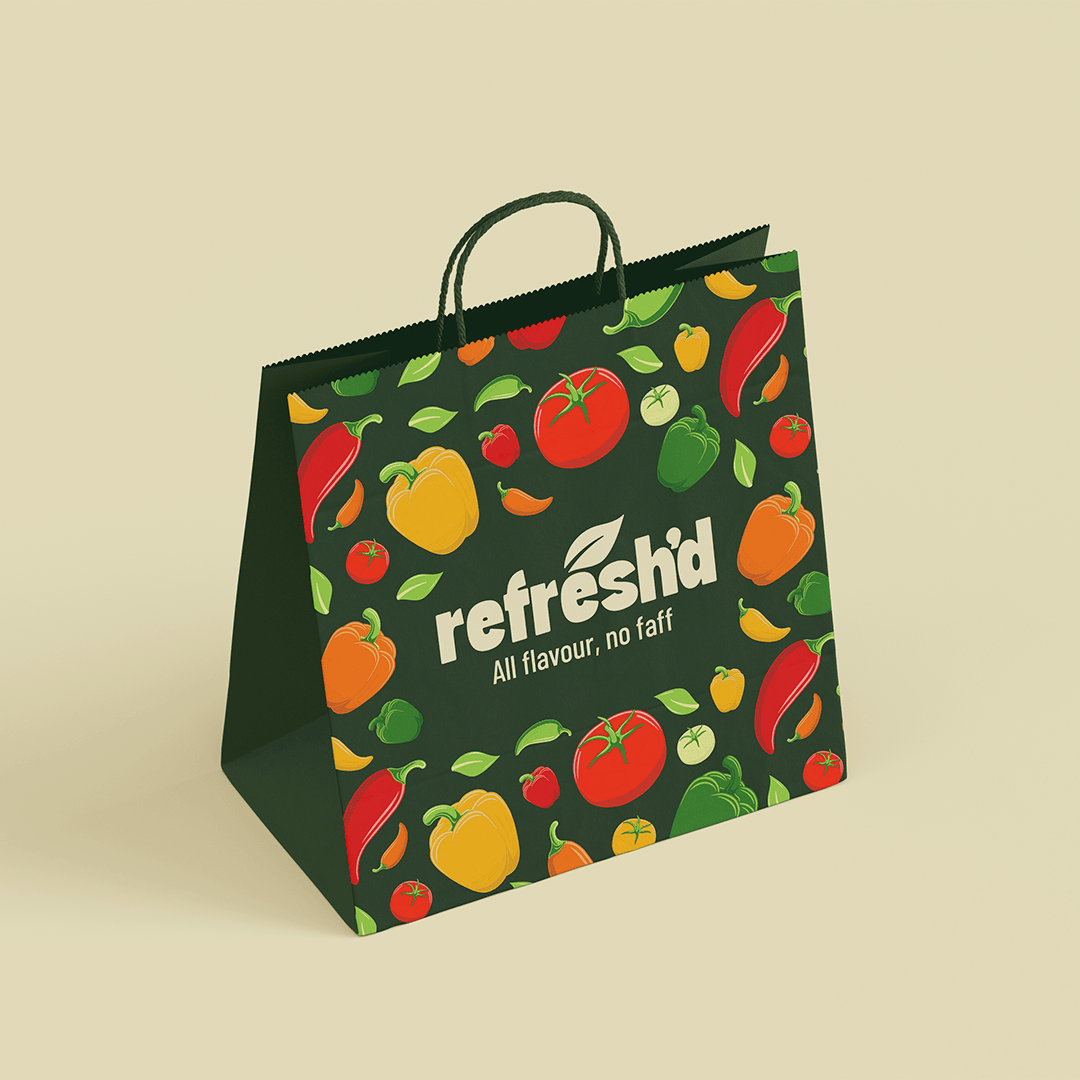
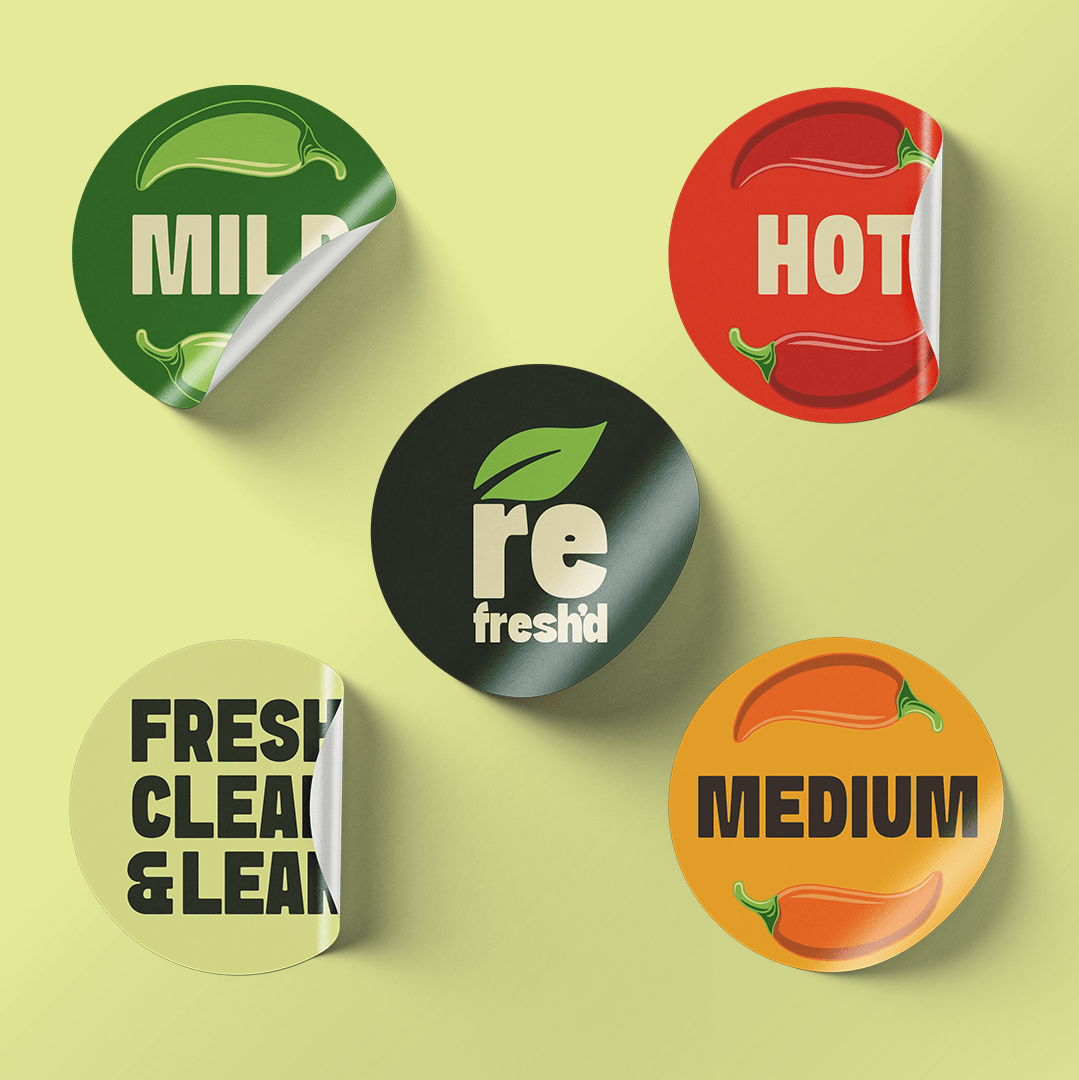
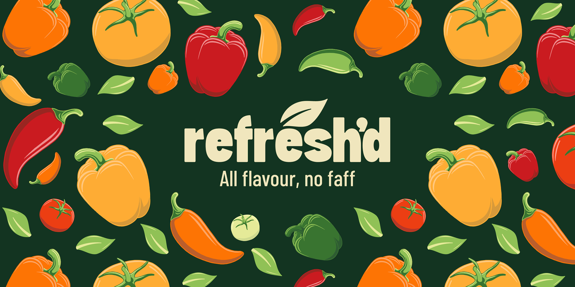
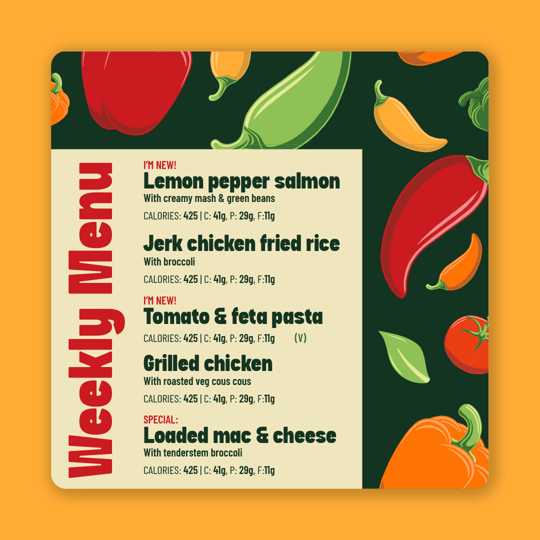
To enhance the brand’s flavour and visual appeal, I created a bank of vegetable icons in a variety of colour options. Their uses are endless, from patterns to printed stickers and everything in between.


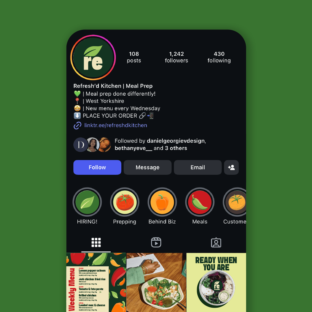
Design & art direction by @danielgeorgievdesign
Photography by @joshuahartphoto
Merch embroidery by @dgsewing